 OmniPressix
Designing fields: text, codes, shapes, arranging
Properties, toolbar and right-click menu#
A click on a field shows its properties on the right in four tabs – instead of one long list to scroll through:
| Tab | Contents |
|---|---|
| Content | Name of the field, text or code content and format, vCard, image source (fixed image or from photos), crop |
| Style | Font, size, bold/italic, alignment, colour; for images corner radius and frame; for shapes fill, line, opacity |
| Arrange | X/Y, width/height, duplicate, lock, delete, align to the card, layer |
| Show | Hide (do not print), show on some cards only |
The tab chosen last stays open for the next field. With the keyboard: ← → switch the tab, Enter jumps from the selected field on the card to the first input field.
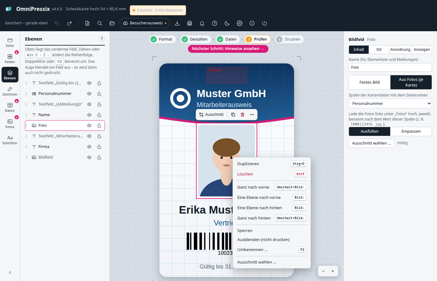
Toolbar at the field: Above the selected field a small bar floats with the most common actions, so the trip to the right is usually unnecessary: for text font, size, bold, italic, alignment and colour; for codes format and colour; for images “Crop” or “Choose image”; for shapes fill and line colour; for several fields align and group. Always included are duplicate, delete and “…” for the right-click menu. It disappears while dragging. If there is no room above, it is below the field. To switch it off: Settings → “Toolbar at the selected field”.
Right-click menu: Right-click a field (or Shift + F10 or the context-menu key for the selection): duplicate, delete, the four layer commands, group/ungroup, lock/unlock, hide, rename, for images “Choose crop …”, for QR codes the vCard assistant. A right-click on free card area offers new fields (a text field at the clicked spot) and “Select all fields”. Choose with ↑ ↓, run with Enter, close with Esc.
Text fields and fonts#
With “+ Text field” you create a new field. A click on it opens its properties on the right:
- Text (with placeholders)
- Font and size in pt, optionally shrunk for long text
- Bold, italic and alignment (left, centred, right, justified: word gaps fill the line; the last line and lines before a line break stay left-aligned)
- Letter spacing in pt (−3 to 20, negative = tighter); preview, wrapping and PDF calculate the same. In the PDF the text is then set character by character and can no longer be selected there as continuous text
- Line spacing as a multiple of the font size (0.8 to 3, default 1.2); applies equally to preview, wrapping, “Shrink for long text” and PDF
- First-line indent (mm) and paragraph spacing (pt): a paragraph is the text between two line breaks. The indent applies to the first line of each paragraph, the spacing is added after every line break
- Underline, strikethrough and all capitals (ß becomes SS; equivalent to the
|grossformat of a placeholder, but for the whole field) - Position in the field: top, middle or bottom, if the field is taller than the text. If the text is taller than the field, it starts at the top
- Colour
- Position and size in millimetres
The PDF sets indent, paragraph spacing, underline and position in the field line by line; the text stays selectable line by line there, and character by character with letter spacing or justified text.
Text styles#
Under the font settings, “Save as text style …” stores the settings of the field (font, size, bold/italic, colour, alignment, spacing, indent, underline, position, shrinking) under a name. “Apply” transfers a style to the selected field or, with multiple selection, to all selected text fields. Styles belong to the layout and are saved with templates and files; a style with the same name is replaced. A style changed later does not change fields it was already applied to.
Long text: shrink the font#
Names, functions or e-mail addresses vary in length. Text that does not fit in the field is wrapped at spaces to the next line and then extends below the field; if a single word is wider than the field, it is even split in the middle of the word. The editor shows such fields with an orange dashed frame, and the card gets the notice ““…” does not fit in the field” (status display, overview, check list before printing).
The remedy is the tick Shrink for long text on the right under Style: the font is then shrunk on each card separately in steps of 0.5 pt until the text fits without splitting a word in the width and height of the field, at most down to the smallest size (suggestion: 60 % of the font size). Short texts keep their size. If the text does not fit even at the smallest size, the notice stays. The name fields of the supplied templates already have the tick set, and new text fields get it from the start.
For barcodes and QR codes with “Show plain text below the code” there is the same tick as Shrink plain text if it does not fit: the plain text stays on one line and is shrunk down to the smallest size until it fits in the width of the field (otherwise it is cut off).
Editor and PDF calculate the same here (width character by character); with the built-in fonts both result in the same size. For a multi-line field choose the height according to how many lines should appear at most.
Available are Helvetica, Times and Courier. You load custom fonts on the left under “Custom fonts” as a .ttf, .otf or collection file (.ttc, .otc; each font it contains is loaded separately).
Font families: If you choose several files of one font at once (e.g. Cantarell-Regular.otf and Cantarell-Bold.otf), the program recognises family name and style from the file. The font then appears only once in the selection, and the buttons B and I take the matching style – in the preview as well as in the PDF. If a style is missing, the closest one steps in (for bold italic e.g. bold). If the detection is wrong, you change the style in the list. Lighter or heavier styles (Light, Medium, Black) are fonts of their own.
OpenType (.otf): Files with CFF outlines are converted to TrueType by the program on loading, because only that can be embedded in the PDF. The outlines stay accurate to less than a thousandth; the hinting (fine-tuning for small screen sizes) is lost, which does not matter for printing.
Barcode and QR code#
With “+ Barcode” you insert a barcode field. At the top of the Properties panel you choose the format:
| Format | Used for | Content |
|---|---|---|
| Code 128 | Customer numbers, ID numbers – the usual barcode | all ASCII characters, no umlauts |
| EAN-13 / EAN-8 | Article numbers in retail | 12 or 13 digits (EAN-8: 7 or 8); without a check digit it is calculated, a wrong one is reported |
| Code 39 | older readers, library and factory IDs | capital letters, digits, space and - . $ / + % |
| QR code | URLs, contact data, several items, scanning with a phone | anything, also umlauts (as UTF-8 with character-set information so that scanners show them correctly) |
| DataMatrix | small areas, industry, access systems | Western European characters (Latin-1) |
| PDF417 | a lot of content in one strip, e.g. driving-licence or boarding-pass readers | Western European characters (Latin-1) |
Logo in the centre: For the QR code, “Choose logo …” puts an image (JPEG, PNG or SVG, which is taken over as a PNG) in the centre, on a white area. The size can be set from 10 to 30 % of the code width (default 22 %). The code is then calculated with the highest error correction (30 %) and becomes slightly denser; check it with a phone after printing, especially with long content and a small field.
Barcodes and PDF417 are stretched to the width and height of the field. QR and DataMatrix are always square: when switching, the field is made square, PDF417 gets a wide aspect ratio. If a content does not fit the format, the preview shows a red field “… does not work with this content” with reason and tip (the full text is in the tooltip) and the data check names the cards concerned.
vCard assistant: For the QR code, “vCard assistant (business card) …” opens a window with first name, last name, company, position, phone, mobile, e-mail, web and address. Matching columns of the card data are already filled in (e.g. {{Vorname}}); fixed text works too. Above the fields are the columns of the loaded table as buttons: a click inserts the placeholder into the field in which the cursor is (the placeholder buttons on the left in the “Card data” area do not apply to the vCard). When scanning, the phone offers to save the contact. Instead of the text field, the field then shows which data the vCard contains; “Edit vCard …” changes it, “Back to normal text” turns it into an ordinary QR field. A vCard makes the code fine-grained, so the field should be at least 20 × 20 mm.
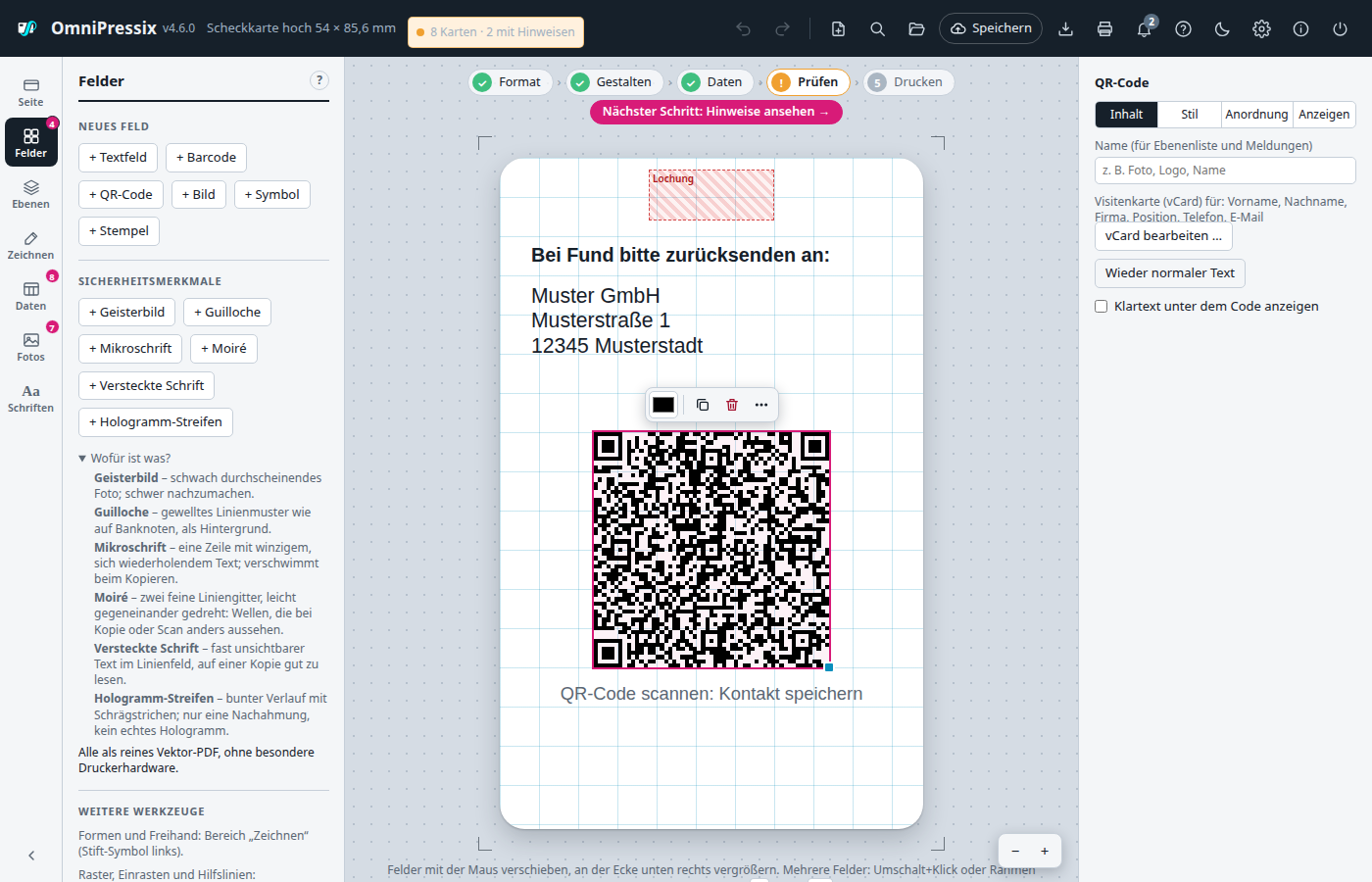
The program builds the vCard anew for every card from the data: as vCard 2.1 (this is also how Android exports contacts), empty entries are dropped, characters such as ; in a company name are escaped. Umlauts are in it as UTF-8 in “quoted-printable” (ü = =C3=BC), so the QR code contains only ASCII characters. That way no scanner has to guess which character set is meant; only the contacts app puts the umlauts back together. If the scanner app shows the raw vCard before saving, you therefore see =C3=BC there instead of ü – in the saved contact the umlauts are correct.
The content is free for all formats: usually a placeholder such as {{Kundennummer}}, but it can also be fixed text or several placeholders combined (e.g. {{Vorname}} {{Nachname}} as a QR code). Optionally the encoded text appears below. The preview in the editor shows exactly the same code as later in the PDF.
Drawing shapes and freehand#
The pen icon in the left bar opens the “Draw” area with a toolbar like in a drawing program:
| Tool | Key | Effect |
|---|---|---|
| Arrow | V | Select and move – the normal work with fields (default) |
| Pen | S | Freehand: draw on the card with the mouse button held down (or pen/finger). Each stroke becomes a field of its own, the pen stays active |
| Rectangle | R | Draw out a rectangle on the card |
| Circle | K | Draw out an ellipse |
| Line | L | Draw a line from point to point (horizontal, vertical or diagonal) |
- With Shift while drawing out you get a square, a circle, or a line only horizontal, vertical or at 45°. If “snap to grid” is on, the corners snap to the set grid size (see Keyboard shortcuts).
- A mere click with rectangle, circle or line creates the shape at default size at that spot.
- After a shape the tool jumps back to the arrow, so that you can move it or adjust it right away. Esc also returns to the arrow, as does switching to another area of the bar.
- Under “Pen and colours for new drawings” you set what is drawn with: line colour and width, whether rectangle/circle get an outline and a fill, fill colour and opacity. The settings are cached in the browser together with the layout.
Every drawn shape stays an ordinary field. When clicked with the arrow, the Properties panel on the right shows its settings: shape (rectangle, ellipse, line), direction of the line, fill (gradient and pattern), outline or line with colour and width, for the rectangle the corner radius and the opacity. Shapes work like all fields with layers (e.g. putting a semi-transparent band behind the text), aligning, undo, templates and A4 sheet. In the PDF they are drawn as vector graphics and stay sharp even when enlarged. The outline is always inside the field – field size = visible size of the shape.
Gradients, patterns, shadows and opacity#
In the Properties panel on the right under “Style”:
- Fill type (for rectangle and ellipse when a fill is on): solid or a gradient from the fill colour to a second colour – horizontal, vertical, diagonal (↘ ↗) or circular.
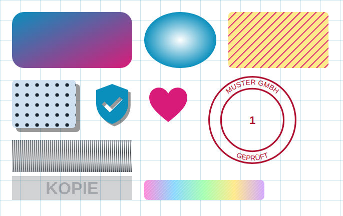
- Pattern (for rectangle and ellipse): stripes, dots, grid, waves or checks in a colour of its own, with an adjustable spacing in mm. The pattern lies over the fill (or alone, without a fill) and is clipped at the outline, also with rounded corners and ellipses. Gradient and pattern can be combined.
- Shadow (for every field): a single-colour, offset copy behind the field with an offset to the right and down (also negative), colour and opacity. There is no blur – PDF files know no soft shadow, and so the printed result looks exactly like the preview. For text the shadow follows the letters, for shapes the shape, for photo and barcode the field.
- Opacity for text and barcode (shapes and image fields already had it). A shadow is multiplied by the opacity of the field.
Symbols and stamps#
- Symbol (“Fields” area → “+ Symbol”): single-colour pictograms such as tick, cross, star, heart, house, phone, e-mail, clock, warning, info, person, Wi-Fi, arrow, location, lock, car, flag, shield, calendar, lightning and ID. The symbol is chosen on the right in the “Style” tab from a selection; the colour is the fill colour. It is a vector graphic and stays sharp at any size; it fills the field keeping its proportions and centred (a square field is best). The symbols are in
internal/symbols/symbols.json; more can be added there (path on a 24 × 24 grid with the commands M, L, C, Z). - Stamp (“Fields” area → “+ Stamp”): a round stamp with two rings, text in the upper and lower arc and a text in the middle. All three texts may contain placeholders, e.g.
{{Nr}}(running number) or{{Nachname}}. If an arc text is too long for the circle, it becomes smaller together with the font; the middle text adapts to the inner circle. Ring colour and width are under “Ring” (0 = no ring), the text colour separately. The stamp is round and uses the smaller side of the field.
Security features#
Under “Fields” → “Security features” (the short explanation “What is what?” is there):
| Feature | What it does |
|---|---|
| Ghost image | faintly showing-through photo, e.g. a second, larger passport photo |
| Guilloche | wavy, intersecting line pattern like on banknotes (density adjustable) |
| Microtext | a line of tiny, repeating text that blurs when copied |
| Moiré | two fine line grids, the second rotated by 3°: waves appear that look different on a copy or scan (line spacing and width adjustable) |
| Hidden text | a field of fine horizontal lines; inside the outline of the text there are additional, offset lines. Almost invisible, the text appears on a copy or scan |
| Hologram stripe | coloured gradient with fine white diagonal strokes; an optical imitation, not a real hologram |
All are drawn as pure vector graphics into the PDF, without special printer hardware. They make simple copying and counterfeiting harder, but do not replace security printing (UV, optically variable inks, hologram foil). How well a feature works when copied depends on printer and copier – it is best to test with a trial card.
Selecting, aligning and distributing several fields#
- Shift + click (or Ctrl + click) on a field adds it to the selection or removes it again.
- Drag a frame: Click and drag on a free spot of the card – all fields that the frame touches are selected. With the Shift key held down they are added to the existing selection.
- Ctrl + A selects all fields of the current card side.
Selected fields are moved together (mouse or arrow keys), duplicated and deleted. On the right in the Properties panel the tools then appear:
- Align: left, horizontally centred, right, top, vertically centred, bottom. With several fields they are aligned to each other (to the common bounding box), with a single field to the card – so e.g. a logo can be centred with one click.
- Distribute evenly (from three fields): the first and the last field stay, the others are moved so that all gaps are equal – horizontally or vertically.
Layers: overlapping fields#
If fields lie on top of each other, the layer decides what is visible on top – in the preview just as in the PDF. New fields are always on top. In the Properties panel under “Arrange” or with the keyboard:
| Button | Key |
|---|---|
| All the way back | Shift + Page Down |
| One layer back | Page Down |
| One layer forward | Page Up |
| All the way forward | Shift + Page Up |
You reach a field that is covered by another one with Tab (next field) or Shift + Tab (previous field).
Layer list: name, hide, reorder fields#
It is clearer in the Layers area (stack icon on the left): it shows all fields of the card side as a list, the frontmost at the top.
- Select: Click an entry, with Shift several. Also fields that are completely covered.
- Rename: Double-click, F2 or on the right under “Content” → “Name”, e.g. “Photo”, “Logo”, “Name”. Without a name the list shows the type and the content (“Text field “{{Nachname}}””). Messages call named fields by name: “Front: field “Photo” is in the chip area” instead of “image field”.
- Order: Drag entries with the mouse or move them with Alt + ↑ / ↓; the top of the list is the front of the card.
- Eye – hide: A hidden field is not on the card, not in the overview and template preview and is not printed, but stays in the layout (handy for variants of an ID). It is also no longer checked (empty entries, blocked zones). The print window names hidden fields so that none is missing by accident.
- Lock: locks the field (see below).
With the keyboard: ↑ ↓ walk through the list, Enter or Space selects, F2 renames, Alt + ↑ / ↓ moves, Del deletes the selected field. Name and hiding belong to the layout and are saved in files and templates; Ctrl+Z undoes both.
Guides, locking and grouping#
Guides: While dragging, left edge, centre and right edge (likewise top, centre, bottom) snap to the edges and centres of the other fields and of the card as soon as they are close enough. A magenta line shows what the field is currently aligned to. This also applies when enlarging at the corner. Guides take priority over the grid; they can be switched off in the “Fields” area (“Guides: … snap”).
Locking: Click “Lock” on the right below the dimensions (also for several fields at once). A locked field can no longer be moved, enlarged, moved with an arrow key, aligned or deleted, and Ctrl+A leaves it out. Dragging on the locked field draws a selection frame as if there were free card area – handy for a large background box. A simple click still selects it, and the right then says “Unlock”. A small lock at the corner shows selected locked fields.
Grouping: Select several fields and click “Group” (or Ctrl+G). After that a click on one field of the group selects all fields of the group; they are moved, aligned and duplicated together (the copy is a group of its own). A double-click selects a single field from the group, e.g. to change only its text. “Ungroup” (or Ctrl+Shift+G) dissolves the group again.
Showing fields on some cards only#
On the right under “Show” every field has “Show field: Always”. Instead, you can choose a condition that refers to a column of the card data:
| Choice | The field appears if … |
|---|---|
| Only if column is not empty | there is something in the column |
| Only if column is empty | the column is empty |
| Only if column equals … | the column has exactly the value, e.g. VIP |
| Only if column does not equal … | the column has a different value |
| Only if column contains … | the value appears anywhere in the column |
| Only if column is greater than … / less than … | the column is a number greater or less than the value (e.g. 17,5; comma or point; if something is not a number, it does not apply) |
| Only if column is in the list … | the value of the column is one of the entries, separated by commas, e.g. Gold, Silber |
Upper/lower case and spaces at the edge do not matter. With + and condition further rows are added that must also apply (AND), e.g. column “Rolle” equals Gast and column “Alter” greater than 17. Older program versions do not know the additional rows and only check the first. Below it says whether the field appears on the card currently shown and on how many cards in total. In the editor a hidden field stays visible, pale and dashed, so that you can keep editing it; in the overview of all cards, in the template previews and in the PDF it is missing. The data check only reports empty placeholders for fields that also appear on the card.
Value depending on a column (e.g. employee/guest)#
Text and barcode fields (without vCard) can have several variants instead of a fixed text, depending on what is in a column of the card data. Under “Content” tick the box “Value depends on a column”, then add rules with “+ Row”: column, comparison (equals, contains …), comparison value and the text that then appears. Example: column “Rolle” contains “Mitarbeiter” → “Staff ID”, contains “Gast” → “Guest ID”.
The rules are checked from top to bottom, the first one that applies wins. If none applies, the normal text in the field above applies – so it sensibly stays as the default or fallback value. The display text of a rule may itself contain placeholders such as {{Nachname}}. The rules also apply to the digital ID (wallet pass), since it uses the same field values.
Colour palette#
Below every colour picker (text colour, fill, outline, frame, pen) there is a row of small colour swatches: at the front the colours chosen last, after a divider all colours that already occur in the layout. A click takes the colour. That way every template automatically has its own palette, and house colours do not have to be set again each time. The colours used last are remembered by the browser.