 OmniPressix
Operation: user interface, card format and card side
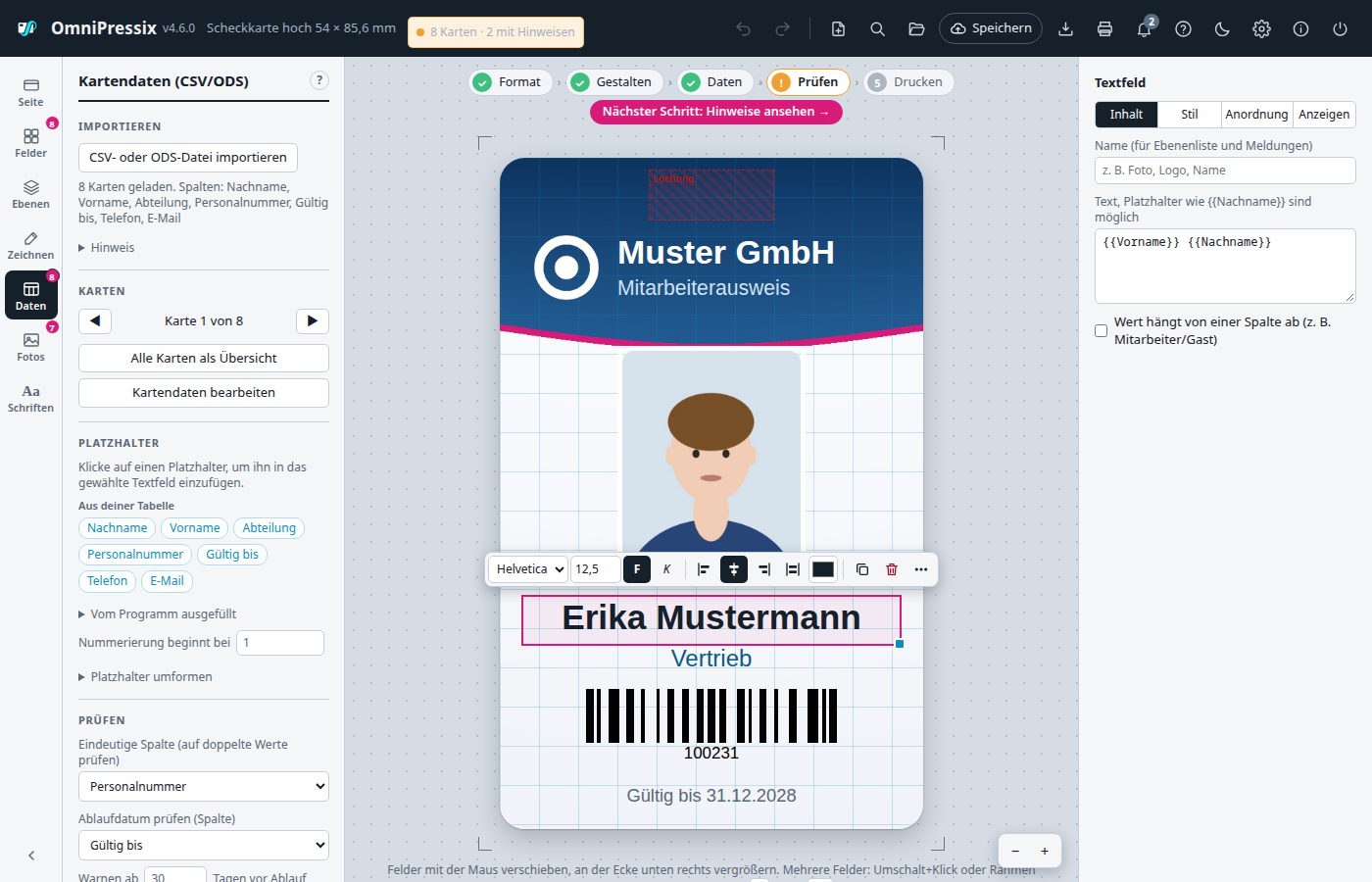
The header#
At the top right, instead of many individual buttons, there is only a slim row of icons:
| Icon | Opens |
|---|---|
| Arrow back / forward | Undo / Redo (greyed out when there is nothing to do) |
| Sheet with plus (New) | Blank card or supplied template, see Starting new |
| Magnifier | Command search (also Ctrl+K) |
| Folder (Templates) | All templates on the server with preview: open, manage, delete (also Ctrl+O), see Template management |
| Cloud “Save” | Saves the layout as a template on the server: after loading with the name of the template and a dot for unsaved changes; a click or Ctrl+S saves directly, see Template management |
| Arrow into tray (File) | Save/load the layout as a file on this computer (Shift+Ctrl+S); in server mode also install OmniPressix as an app |
| “Print front”/“Print back”, “Print directly”, “Create PDF” | |
| Bell | Message history: the latest messages of this session to read again, see Messages |
| Question mark (Help) | Help with guide, search, tips and common problems (also F1), tab “Keyboard shortcuts” (also the ? key) |
| Gear | Settings (also Ctrl+,), including the design (light, dark, like the system) |
| ⓘ Info | Program name, version, idea and implementation |
| Power icon | Quit program |
“Save” and “Print” each open a small window with the related buttons, just like the info dialog. That keeps the header tidy even when more functions are added over time.
Status display: Next to the format it shows how many cards are loaded and whether any have notices – green when everything is fine, orange for notices (empty entries, duplicate values, missing photos, invalid codes, expiry date) or for layout notices (fields in a blocked zone, placeholders without a column). A click opens the overview with exactly these cards; the tooltip names the layout notices.
Settings: The gear at the top (or Ctrl+,) opens the settings: language, tip at start and tip below the card, workflow bar on/off, show the introduction again, grid (show, line spacing, snapping) and guides, default values for new fields (font, size, colour, barcode format) as well as “forget recently used colours and commands” and “reset all settings”. They apply to this browser and are kept on signing out; they do not change layouts or templates. Grid and guides used to be in the “Fields” area, the language in the info window.
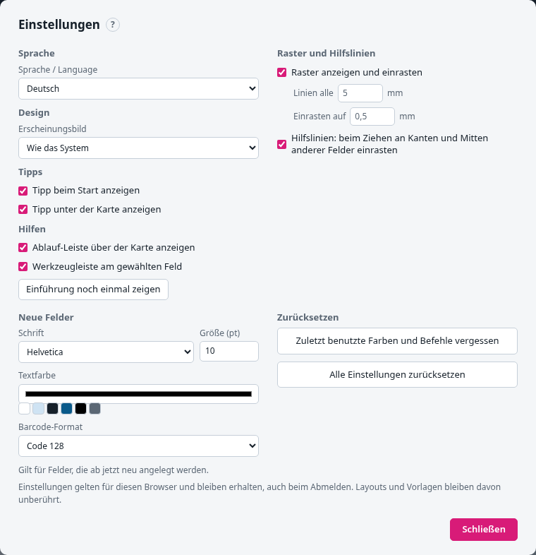
Tabs at the top of the window switch between the areas:
- General: everything mentioned above.
- Formats: edit the current format (dimensions, grid of the custom label sheet), hide built-in formats (Zweckform, Herma, Brother, Dymo …) or change them with “Adjust …” (dimensions; for sheets columns, rows, margin and gap; “Original” resets), rename custom formats, change their dimensions, sort and delete them. An adjusted sheet must fit on A4.
- Profiles: rename, sort and delete print profiles and change their settings with “Edit …” (paper, pages, duplex, bleed, print-shop PDF, copies, cut outline, rotation, print offset), rename and delete saved grids; forget remembered assignments (columns, directory search, camera). The print profile with the dot is selected when the Print window opens.
- Interface: hide areas of the sidebar (Fields, Layers, Draw, Photos, Fonts), header icons (Messages, Help, Info), restricted zones, “Save format” and functions of the Print window (profiles, label roll, print-shop PDF, copies, cut outline, print offset). “Show all” brings them back. Page and data always stay visible.
- Backup: save settings, formats, profiles and grids as a file and load them on another device. This is also where it says where they are stored.
With server operation with sign-in the settings are kept on the server, one file per user, and follow you to every device. Without sign-in they stay in the browser.
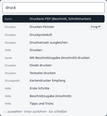
Command search: Ctrl+K (Mac: ⌘K) or the magnifier at the top opens a search field. A keyword is enough – “cut”, “face”, “a4”, “vcard”, “portrait” –, choose with ↑ ↓, Enter runs it. It finds commands, formats, print profiles and help topics, in German and English, regardless of umlauts. Commands that do not fit at the moment (e.g. “Choose crop” without a selected image field) do not appear; recently used ones are at the top.
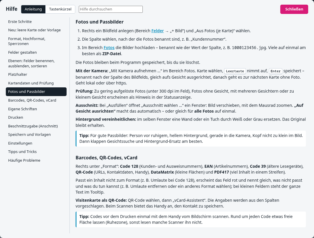
Help in the editor: The question mark at the top (or F1) opens a guide with a table of contents and search: first steps, format, fields, placeholders, card data, photos, codes, fonts, printing, saving, tips and common problems. Links in it open directly the area or window described. A small ? next to every area heading on the left and in the Print, Save and Crop windows jumps to the matching topic. Below the card there is a tip, “›” shows the next one. The text is in web/help.html and can be extended there without programming knowledge (rebuild the program afterwards).
Tip at start: At every start a small window with a tip appears – the next one each time, with ‹ › to browse. The tick “Do not show at start again” switches it off. To switch it back on: Help → “Tips and tricks” → open “Tip window” and remove the tick. The setting is remembered by the browser (per browser and computer).
Introduction at first start#
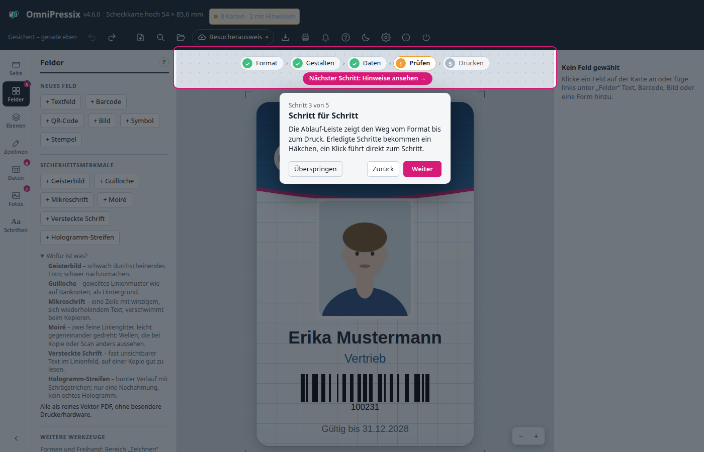
At the very first start in a browser, a short introduction in five steps appears instead of the tip. Each step highlights a part of the user interface and explains it: the areas on the left, the card with the properties on the right, the workflow bar, “New” with the supplied templates and the icons at the top right. “Next” (also Enter or →), “Back” (←), “Skip” (Esc). Anyone who goes through the introduction to the end then immediately gets the choice “How would you like to start?” (see Starting new); with Skip everything stays as it is. After that it does not appear again; you can repeat it in the settings (“Show the introduction again”), through the command search (“Introduction”) or in the help under “First steps”. If you have already used OmniPressix in this browser, you do not get it automatically after an update.
Workflow bar#
Above the card a slim bar shows the five working steps: Format → Design → Data → Check → Print. Completed steps get a green tick, the next open one has a coloured outline. A click leads to the step: Format opens the “Card side” area, Design the “Fields” area, Data the “Card data” area, Check the cards with notices (like a click on the status display), Print the print window. To the right of the steps there is a button “Next step: …” (e.g. “Load card data”) that leads directly there; when all steps are done it says “All done ✓”.
| Step | Done when … |
|---|---|
| Format | a format, orientation or blocked zones were chosen or a template or layout is loaded |
| Design | the layout was changed or a ready-made template is chosen |
| Data | card data is loaded – or the layout needs none (no placeholders, no photos per card) |
| Check | no card and no field has a notice; with notices orange with “!” |
| a PDF was created or printed since the last change |
The state is cached in the browser together with the layout. The bar can be switched off in the settings (“Show the workflow bar above the card”).
Starting new: blank card or supplied template#
The New icon at the top (sheet with plus) – or “Start a new layout …” in the Save window – opens a choice with previews. At the very top is “Start with a sample card”: it loads the “Customer card” template and the sample CSV with five people, so that you can try the program without your own data (preview, check, print). A new document starts without the card data, loaded fonts and photos of the previous one (privacy): if there are any, the editor asks first, and the photos are deleted on the server. Loading a saved template or file leaves card data and photos in place. Below are the templates:
| Template | Format | Contents |
|---|---|---|
| Blank card | credit card landscape | no fields |
| Customer card | credit card landscape | Name, address, customer number, barcode, logo space (the former default card) |
| Staff ID | credit card portrait, chip blocked zone | Company name, passport photo, name, function, staff number; back with ownership notice, validity and barcode |
| Business card | 85 × 55 mm | Name, function, company, address, phone, e-mail, QR code with vCard; back with company name |
| Name badge | 90 × 54 mm | Company name, large first name, last name, function |
| Name badge large | custom format, 150 × 200 mm | Stand or table sign: company name, large first name, last name, function |
| Membership card | credit card landscape | Club name, name, membership number, “Valid until” one year from printing, barcode, passport photo |
| Visitor badge | 90 × 54 mm | Red band “VISITOR”, name, company, visit date (today), notice on wearing it; back with return notice and address |
| Event ticket | custom format, 190 × 70 mm | Event name, date, place, holder, category, price, ticket no., tear-off stub with perforation and QR code (ticket number) for entry; back with notes |
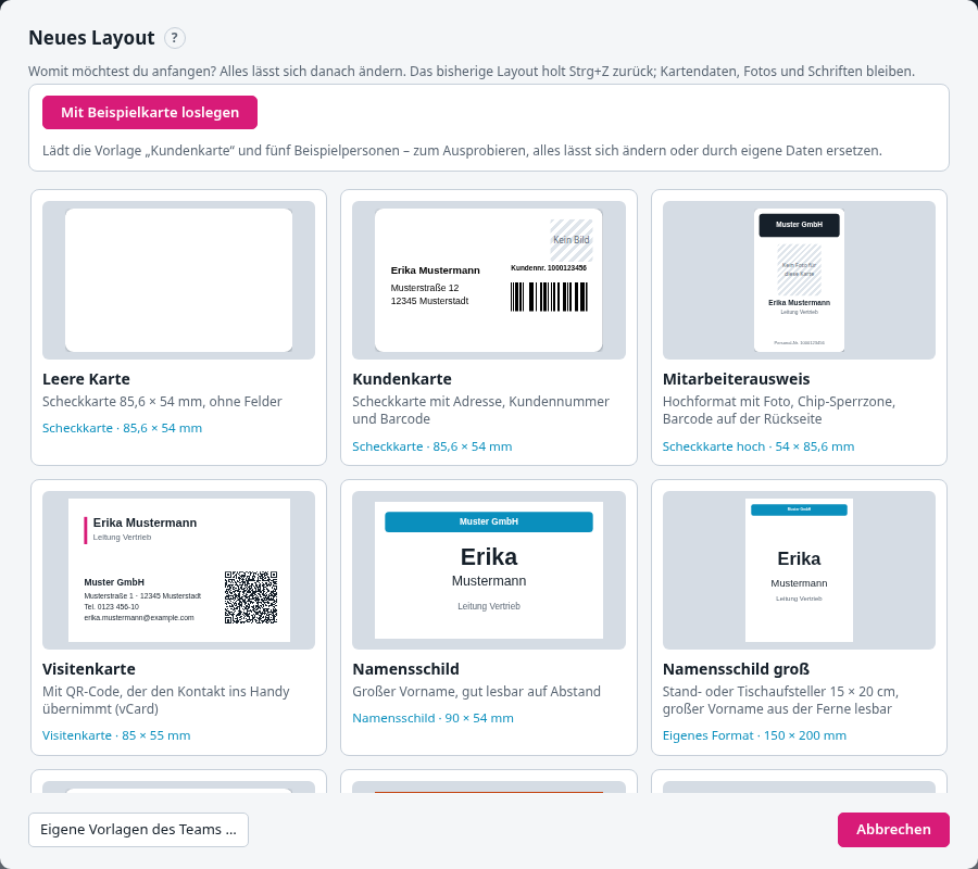
Fixed texts such as “Muster GmbH” or “Musterverein e. V.” are meant to be overwritten: click them and change them on the right. The placeholders match the sample CSV ({{Vorname}}, {{Nachname}}, {{Kundennummer}}, {{Funktion}}, {{Telefon}}, {{EMail}}); if the columns of your own table are named differently, adapt the placeholders. Passport photos come from the photos, named after the customer number. Card data, photos, fonts and print settings are kept when switching, and Ctrl+Z brings back the previous layout. The templates are built into the program and are available in both languages; the team’s own templates are described under Templates. Through the command search any of them can also be chosen directly (e.g. “business card”).
Reading messages again#
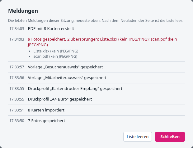
Messages only appear at the bottom for a few seconds. The bell at the top collects them: a number shows how many have been added since it was last opened (red if one of them is an error). A click opens the list of the last 50 messages of this session with the time, newest on top, errors in red. Some messages have details there that have no room below – for instance, when uploading photos, the full list of skipped files with the reason. “Clear list” deletes it; after reloading the page it starts afresh anyway.
Dragging files in (drag & drop)#
Files can simply be dragged into the window; OmniPressix recognises the type itself. While dragging, a frame shows that you can let go.
| File | Becomes |
|---|---|
.csv, .txt, .ods | Card data (with several only the first) |
.zip | Photos |
.ttf, .otf | Fonts |
.opx, .json | Load layout; with the Templates window open: import templates |
several images (JPEG, PNG) or one image named after a value in the card data (1000123456.jpg) | Photos |
| an image dragged onto an image field with a fixed image (it gets a blue outline) | its image |
| another single image | Question: background image of the current side, new image field (e.g. logo), selected image field or photo (SVG is converted to a PNG and never offered as a photo) |
Other files are skipped with a message.
Pasting with Ctrl+V: An image from the clipboard (screenshot, copied logo) or copied SVG text is treated like a dragged file. If an image field with a fixed image is selected, it replaces its image, otherwise the question from the table above appears. In input fields and while windows are open, Ctrl+V stays the ordinary paste.
Dark design#
Settings → “Design”: Light, Dark or Like the system (default, follows the operating system’s setting, even when it changes). The card itself stays white because it shows what is printed. The choice applies to this browser; you can switch quickly via the command search (“dark”) or the moon button in the header.
Operating with the keyboard#
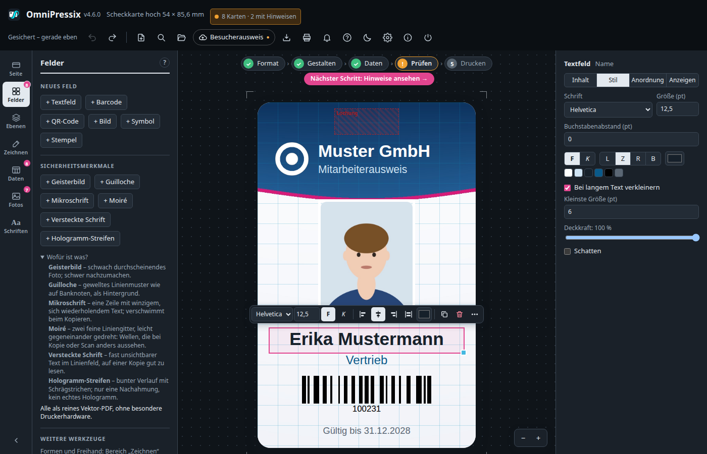
Everything can be operated without a mouse; a clear blue frame shows where the focus is.
- F6 / Shift + F6 jumps between the areas: header, left bar (icons), content of the area, card and right panel. Within an area Tab moves on.
- On the card Tab selects the fields, arrow keys move, Enter jumps to the first input field on the right, F2 renames, Shift + F10 opens the right-click menu.
- Right panel: ← → switch between the tabs.
- Windows: Tab, Enter and Esc; the overview of all cards with Tab and Enter; in the Crop window the arrow keys move the crop, + and − zoom.
The left sidebar#
At the left of the editor there is a slim column of icons (Card side, Fields, Layers, Draw, Card data, Photos, Custom fonts). The templates are at the top in the header. A click on an icon shows next to it only the content of that one area – the other areas are not visible at the same time, so the bar does not grow in height, no matter how many areas there are.
- Small numbers on the icons (e.g. on “Fields” or “Photos”) show at a glance how many elements are already in that area, without your having to open it.
- If you click the already active icon, the whole sidebar collapses and the work area in the middle gets more room. Another click on an icon opens it again.
- The arrow button at the bottom of the icon column collapses and expands the bar in the same way.
Card format#
At the very top of the “Card side” area you choose the format. The header shows it next to the version number.
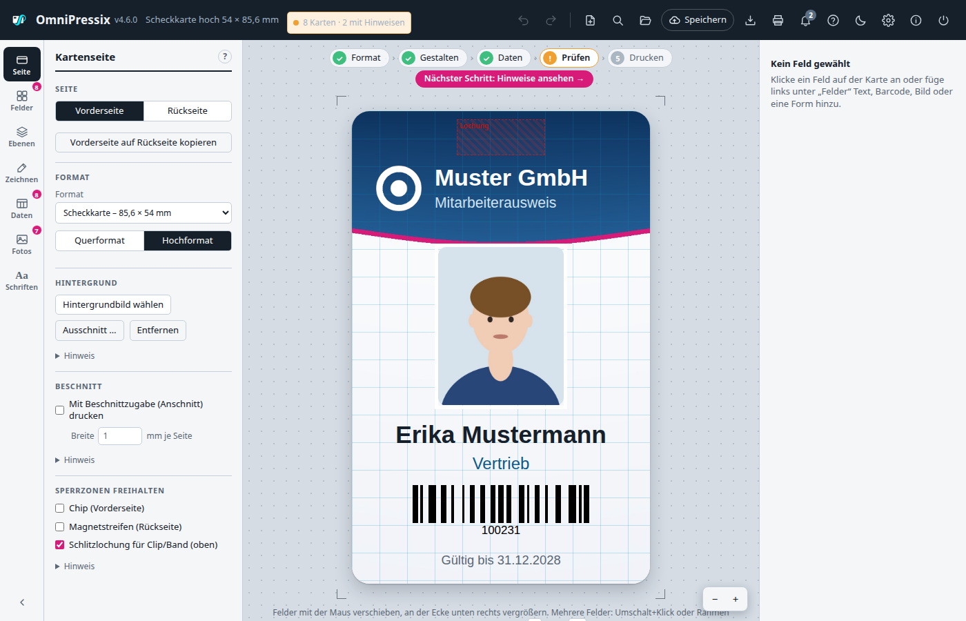
| Format | Size | Note |
|---|---|---|
| Credit card | 85.6 × 54 mm | Default, for card printers (plastic cards, ID-1) |
| Business card | 85 × 55 mm | |
| Name badge | 90 × 54 mm | usual insert badges |
| Name badge small | 75 × 40 mm | |
| Label L7160 | 63.5 × 38.1 mm | 21 per A4 sheet (3 × 7) |
| Label L7163 | 99.1 × 38.1 mm | 14 per A4 sheet (2 × 7) |
| Label L7165 | 99.1 × 67.7 mm | 8 per A4 sheet (2 × 4) |
| Label 3475 | 70 × 36 mm | 24 per A4 sheet (3 × 8), borderless |
| Custom format | 20–200 × 20–280 mm | Enter width and height freely |
Saving custom formats#
If you often need the same special format (luggage tag, event ticket, bookmark …), enter the dimensions once under “Custom format” and choose “Save as format …”. After asking for a name, the format appears in the format list under “Saved formats” (with dimensions, alphabetical) and can be chosen in any layout, also through the command search (Ctrl+K). The same name overwrites the dimensions after a question. If a saved format is currently in the card, “Delete format” is offered; cards and layouts that already use it stay unchanged.
It is saved in the browser (like the print profiles), not in the layout: the layout still contains only “Custom format” with width and height and can be opened anywhere, even without the saved formats. On another computer or browser they are not available; up to 30 formats are possible. Label sheets and the portrait switch do not belong to it (with a custom format width and height are swapped; the swapped size is then a different, unsaved format).
The format belongs to the layout: it is saved with “Save layout” and in templates and undone with Ctrl+Z. When switching, the fields stay where they are; if some protrude beyond the new edge, the editor points this out. For a label the Print window automatically switches to the matching label sheet.
Portrait format#
Below the format you switch between landscape and portrait, e.g. for staff IDs that hang upright on a lanyard. The card is rotated: 85.6 × 54 mm becomes 54 × 85.6 mm; the header then shows e.g. “Credit card portrait 54 × 85.6 mm”. With a custom format width and height are simply swapped. Labels have no portrait format because the sheet is fixed.
The fields stay where they are when switching; the editor reports anything that protrudes beyond the edge. A background image no longer fits afterwards and has to be chosen again. The orientation belongs to the layout and is saved with it. How portrait cards are sent to a card printer that only feeds landscape is described under Rotating portrait format for the card printer.
Blocked zones: chip, magnetic stripe, punch hole#
At the bottom of the “Card side” area you can show areas in which nothing important should be placed:
| Blocked zone | Side | Position (landscape) |
|---|---|---|
| Chip | Front | Contact area to ISO 7816-2, left of centre (about 8–21 mm from the left, 18–30 mm from the top) |
| Magnetic stripe | Back | across the whole width, about 4.5–17.5 mm from the top (ISO 7811), as seen when looking at the turned card |
| Slot punch | both | Slot for a clip or lanyard, centred on the top edge (16 × 6.5 mm) |
Chip and magnetic stripe exist only for the credit card (85.6 × 54 mm, also as a custom format), the punch for all formats except labels. The zones are shaded red and are not printed. A field that protrudes into one gets a red dashed frame, and the check list before printing names it (“Front: Text field “{{Nachname}}” lies in the chip area”) – even without loaded card data.
In portrait the zones rotate with the card. Under “Chip in portrait” you choose whether the chip is at the bottom (default) or top; the magnetic stripe on the back is then at the right or left edge.
The dimensions include a small safety margin; the card supplier gives exact values. The zones are only an aid in the editor: background images are printed there too. Many card-printer drivers have a setting of their own to leave out chip and stripe when printing.
Front and back#
The default front contains last name, first name, street, postcode and town and next to it the customer number with barcode. With the “Front” and “Back” tabs you switch the card side. Each side has its own background image and its own fields. The image is cropped to the card format in the centre and embedded at 300 dpi. With “Remove” you take it out again.
The original stays in the layout (reduced to at most 3400 pixels on the longer side). With “Crop …” you choose which part of the image goes on the card – like the image crop of the photos. If you change format or orientation, the image is cropped again automatically. Backgrounds from layouts of older versions have no original; the editor reports them for re-choosing after a format change. Layout files and templates get somewhat larger because of the original; as .opx the increase stays small, because images are not stored in it as Base64 text.
Undo and automatic caching#
Ctrl + Z undoes the last change, Ctrl + Y (or Ctrl + Shift + Z) restores it; the same works with the arrow icons at the top right. Undo covers everything about fields and background images: moving, resizing, properties, adding, deleting, duplicating, aligning, layers, also loading a layout or a template. Up to 100 steps are remembered. Typing in an input field or holding arrow keys down each count as one step. As long as the cursor is in an input field on the right, the browser’s Ctrl + Z applies there to the text in the field.
Not undoable are: loading/removing fonts, importing CSV, uploading/deleting photos and crops of photos (they belong to the photo, not to the layout).
The header shows when it was last saved (“Saved – 2 min ago”; “Not saved” if the browser refuses to save).
The layout is also cached in the browser every few seconds (fields, backgrounds, fonts, CSV data and the print settings; photos are in the photo folder). After an accidental reload, a browser crash or at the next program start the last state is back, and a notice at the bottom shows from when it is. Immediately afterwards Ctrl + Z brings back the standard card; starting from scratch also works with New.
The cache belongs to the browser and to the address of the program: if you start OmniPressix with a different port (-addr) or open it in another browser, it has its own state there. It therefore does not replace saving as a file or template.
Tablet and narrow windows#
For windows up to 1000 pixels wide (tablet, half window) the user interface moves closer together: the left bar shows only the icons, their content overlays the card when tapped and collapses again when you tap the card. The properties appear at the bottom as a bar while a field is selected. Buttons and input fields are larger for fingers; fields can be moved and enlarged by finger. For windows under 640 pixels the header and windows are more compact too.
Keyboard shortcuts#
The ? key also shows this overview in the editor (Help window, tab “Keyboard shortcuts”). The shortcuts work as long as no input field on the right is active – a click on the card is enough. On the Mac ⌘ applies instead of Ctrl.
| Key | Effect |
|---|---|
| Ctrl + P | Open the Print window (instead of the browser’s “Print page” dialog) |
| Ctrl + S | Save into the loaded template (without a loaded template: “Save as”) |
| Shift + Ctrl + S | Save layout as a file |
| Click / Shift + click | Select a field / add to or remove from the selection |
| Ctrl + A | Select all fields of the side |
| Tab / Shift + Tab | Select next / previous field |
| Double-click | Select a single field from a group |
| Ctrl + G / Ctrl + Shift + G | Group / ungroup |
| V / S / R / K / L | Drawing tool: arrow / pen / rectangle / circle / line |
| Esc | Drawing tool: back to the arrow, otherwise clear the selection |
| Arrow keys | Move the selection to the next grid position (snap size, default 0.5 mm); without grid by 0.5 mm |
| Shift + arrow keys | 4 grid steps (default 2 mm) |
| Alt + arrow keys | fine, by 0.1 mm, independent of the grid |
| Del / Backspace | Delete |
| Ctrl + D | Duplicate |
| Page Up / Page Down | One layer forward / back |
| Shift + Page Up / Page Down | All the way forward / back |
| Ctrl + Z | Undo |
| Ctrl + Y / Ctrl + Shift + Z | Redo |
| Ctrl + O | Open templates |
| Enter | Edit the selected field on the right (first input field) |
| F2 | Rename the selected field |
| Shift + F10 | Right-click menu for the selection |
| F6 / Shift + F6 | Next / previous area |
| ? | Show keyboard shortcuts |
| F1 | Help with guide and tips |
The option “Show grid and snap” in the “Fields” area shows a grid and lets fields snap while dragging. You set the grid size below it:
- Lines every … mm (1–20 mm, default 5 mm): spacing of the grid lines on the card.
- Snap to … mm (0.1–10 mm, default 0.5 mm): step size when moving with the mouse and the arrow keys, when resizing and when drawing out shapes. With e.g. 5 mm a field jumps with the arrow key from 6 mm to 10, 15, 20 … mm; Shift + arrow jumps 4 grid steps, Alt + arrow moves finely by 0.1 mm. With 0.1 mm you can place almost freely.
If “Show grid and snap” is off, both fields are greyed out; the arrow keys then move by 0.5 mm (Shift: 2 mm). Both values are saved in the browser and apply again at the next start.